Vulnerability Risk Management
About XM Cyber
XM Cyber is a continuous exposure management platform. It constantly models how an attacker could move through a company's network and shows security teams which weaknesses actually matter, because they sit on a real path to something valuable. The engine behind it is an attack graph: devices and accounts as nodes, attack techniques as the links between them, and choke points where many attack paths converge.
VRM: Vulnerability Risk Management
VRM is the module where security teams find, prioritize, and fix software vulnerabilities. A large enterprise produces tens of thousands of vulnerability findings, and almost all of them are noise. Instead of one long list sorted by severity, we turns the same findings into four views that answer four different questions, tied together by a single filter that follows the user wherever they go.
My Role
Lead Product Designer for VRM3 and Design Owner for the VRM Module
I worked with one product manager, one tech lead, and a dedicated engineering team, plus a technical writer and QA. I owned the problem framing with the PM, the data and filter model, the four table views and their full column behavior, the detail drawer, the vulnerability tab inside the entity card, the dashboard, and the analytics needed to see how the module is actually used.
I stayed closely involved after handoff: reviewing the built interface against the design in code review, commenting on spacing, tokens, states, and responsive behavior, and checking implementations locally in Storybook before final sign-off.
The Problem
- Rigid Legacy Workflows: The same findings had to be read in different ways depending on the job (patching one vulnerability across the estate, hardening a single critical device, or removing a vulnerable product version), but the legacy product forced every workflow into a single view.
- Filters Did Not Travel: Narrowing to a business unit in one view and moving to another meant starting the query again, dozens of times in a single triage session.
- Lack of Accountable Exception Handling: Every environment has findings that are known, accepted, or blocked for reasons the tool cannot see, and with nowhere to put them, they resurfaced every session until the list lost credibility.
- Density Without Discipline: With over 40 available data attributes forced into single tables, information density degraded readability. Tooltips had accumulated to the point of adding noise instead of explaining concepts clearly.
- Complex Multi-Location Installs: One vulnerable product can be installed in many locations on one device. Showing every install path destroyed table readability; showing none removed exactly what the person doing the patching needed.
- Siloed Device Posture: Vulnerability posture was invisible from the device level. Someone investigating an entity had to leave for another module and rebuild their filters just to learn whether that device was a problem.
Business Goals
- Win on Parity First: Buyers compare this module against dedicated vulnerability management tools, so the core mechanics have to be as strong as theirs before our attack path advantage can land effectively.
- Shorten Path to Remediation: Accelerate the time from finding a vulnerability to applying a fix.
- Enable Evidence-Based Prioritization: Make the module measurable so decisions come from data instead of instinct.
- Ensure Scalable Interaction Patterns: Support growing data volumes across enterprise estates without requiring UI rebuilds.
Target Audience
Enterprise security teams and the IT teams who carry out the actual patching.
User Persona
- Two mindsets arrive at the same screen:
- The Triager: Works across the whole estate and asks which few of thousands of findings matter this week.
- The Fixer: Usually in IT rather than security, focuses on one device or one product and needs to know exactly what to change.
- Designing for only one of these personas was what made the old interface fail for both.
Research & Competitor Analysis
- My research came from three directions, as a formal field study was not possible within the delivery timeline:
- Continuous Field Feedback: Gathered insights through sales engineers and customer success teams who sit in real customer sessions and observe where users get stuck.
- Product Analytics: Analyzed usage telemetry to see which views were actually opened rather than where we assumed users ended up.
- Cross-Functional Working Sessions: Conducted structured sessions with the product manager, tech lead, and QA to uncover edge cases in the underlying data.
- Competitor Benchmarking: Reviewed vulnerability interfaces for Rapid7, AttackIQ, and Tenable using live product demos. The evaluation showed that while competitors list and score vulnerabilities, almost no platform helps users hold one line of inquiry across different ways of grouping the same data.
Product Goals
- One Filter, Many Views: The filter represents the user's question, not a property of the specific screen they happen to be on.
- Named Views: Teach the domain model by helping users learn that evaluating a device versus a product represents two distinct questions.
- Accountable Suppression: Ensure setting an issue aside is a deliberate decision with a documented reason and an expiry date.
- Progressive Disclosure: Combine restrained default views with detail on demand to manage visual density.
- Contextual Posture: Bring vulnerability information directly to the device interface rather than forcing navigation to another module.
Solution
I consolidated the findings into four grouping views over a single dataset and connected them with a unified filter engine.
Four Views, One Dataset
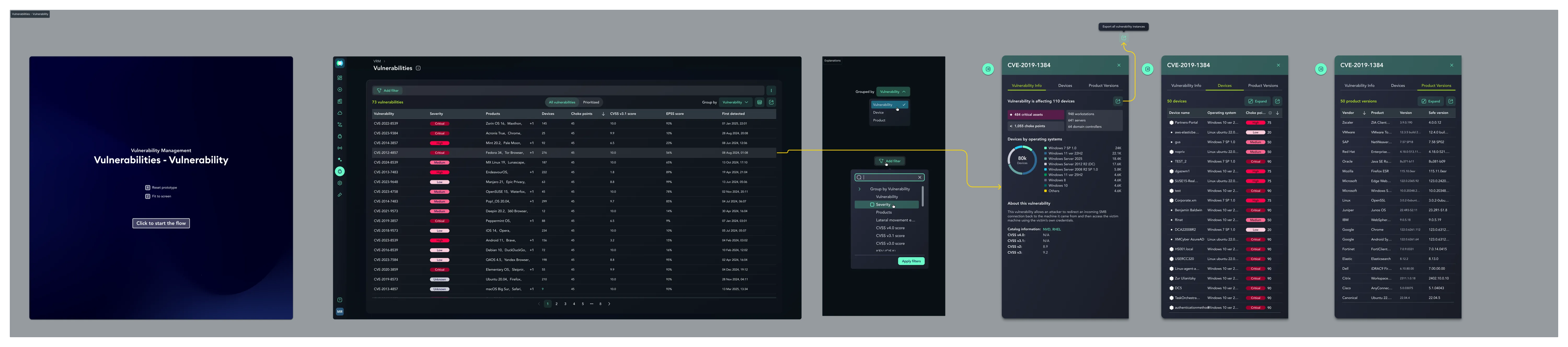
Group by None: Shows every unique vulnerability on a specific product version on a specific device.
Group by Vulnerability: Answers "where does this CVE exist across the network".
Group by Device: Answers "how severe is this machine's exposure".
Group by Product: Answers "what software should we upgrade or remove".
- Tradeoff : Explicit named views guide users toward distinct analytical approaches, though every new column must be designed and evaluated across all four view contexts.
A Filter That Follows You
A user defines a filter once, and it persists seamlessly as they navigate between views. Filters can be applied from the filter panel or directly from a table column, and they persist in the URL, making a triage session a shareable link for colleagues.
If a filter criteria is non-applicable to the current view layout, it remains active in the backend query and is clearly indicated in the active filter bar as a global parameter.
Accurate Aggregate Counts
Every aggregate count recalculates against the active filter. A device row showing twelve vulnerabilities reflects twelve matching the active filter, not twelve total findings.
Restrained Defaults & Progressive Disclosure
Out of ~40 available columns, I established a conservative default set per view and exposed the rest through a column picker. Default sorting prioritizes choke point scores to surface consequential risks first. Tooltips were pruned to essential technical concepts, while secondary details were moved to hover states. Default table sorting prioritizes vulnerabilities linked directly to active attack paths and choke points over standard CVSS severity.
Primary Path First for Installs
For install locations, the table displays the primary path with a clear truncation indicator. It expands via a side drawer to preserve row-height consistency across the main table.
Accountable Suppression Workflows
Findings can be set aside with a mandatory reason and time limit rather than deleted, keeping suppressed items visible in dedicated audit views until remediated or expired.
Contextual Device Posture
A dedicated vulnerabilities tab inside the entity card provides security scores, an interactive severity breakdown, and historical trends directly where an engineer investigates a device.
Technical & Backend Alignment
Established early alignment with engineering on core data constraints: a single data pipeline feeds all four views, filters function correctly on non-visible attributes, and cross-table queries maintain performance without silent query failures.
UX Flow
- The navigation flow is intentionally flat:
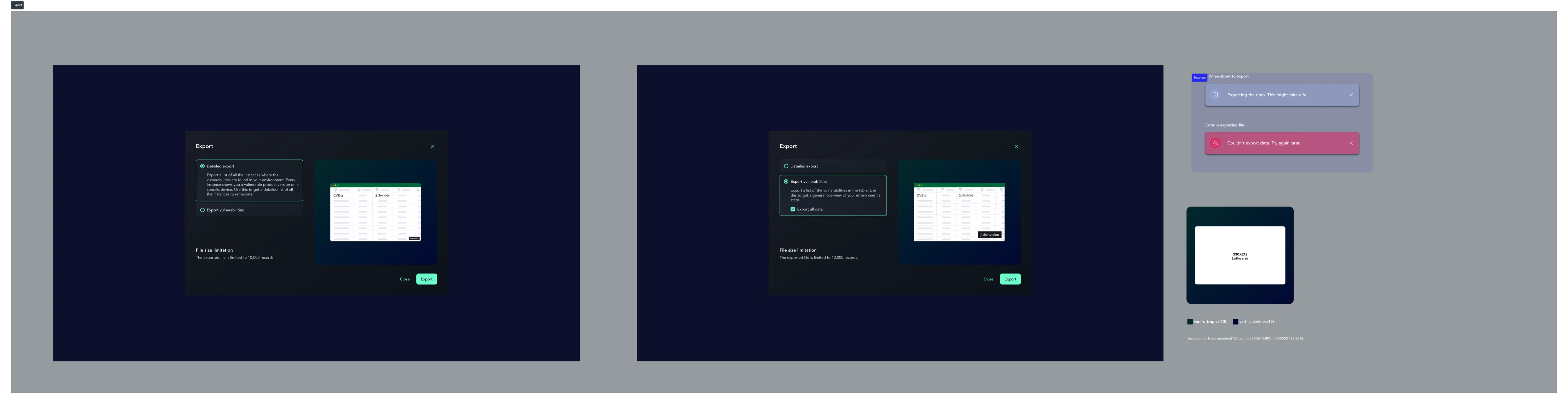
- Dashboard ➔ Findings Table (Set Filter) ➔ Pivot Across 4 Grouping Views ➔ Detail Drawer Inspection ➔ Ticket Export / Rescan Trigger.
Old Flow :
- Dashboard
- Single Table
- Dead end (any change in scope required resetting filters and starting over).
New Flow :
- One filter
- Four specialized lenses
- Detail drawer
- Actionable export.
Outcome & Status
- V2 shipped and is running in production. VRM3 is in active development targeted for release, phased so that the core filter engine and refreshed table views land first, followed by the granular instance view, embedded drawer tables, and expanded export options.
- Rather than quoting arbitrary projections for a module still in active development, the focus remains on validating system architecture and user workflows through production telemetry as features roll out.
Initial Measurements & Telemetry
I defined the telemetry and measurement plan alongside the product team prior to rollout:
- Filter Re-Entry Rate: Tracking how often users re-apply identical filters after switching views to evaluate whether filter persistence effectively eliminates redundant steps.
- View Navigation Patterns: Monitoring initial entry views and pivot frequency to validate or refine the four-view mental model.
- Investigation Depth: Measuring the number of views visited within a single filtered session to verify cross-view exploration.
- Drawer Interaction Rate: Tracking engagement with detail drawers as a signal for whether users are finding necessary context efficiently.
- Suppression Adoption Rates: Monitoring suppression usage to ensure the feature is used for legitimate workflow management rather than hiding unaddressed backlog items.
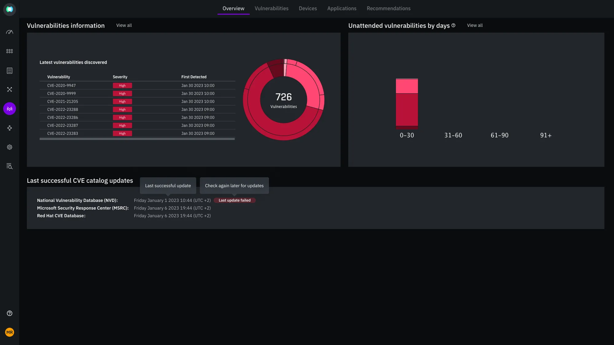
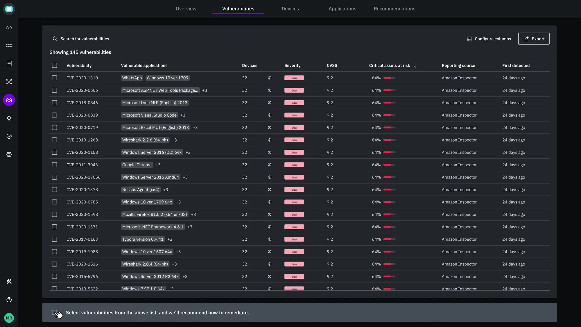
Legacy Interface: Dense, fragmented views forcing repetitive filter setups and unprioritized CVE lists.
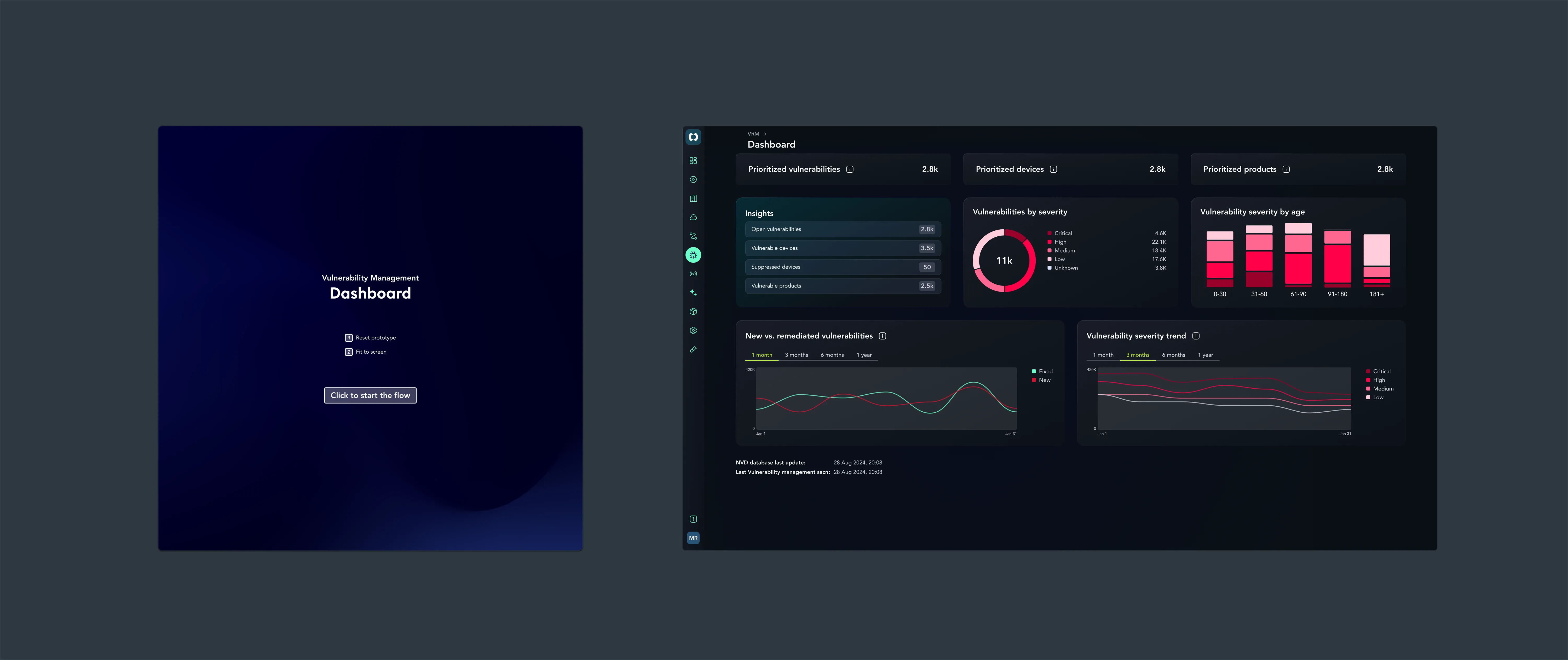
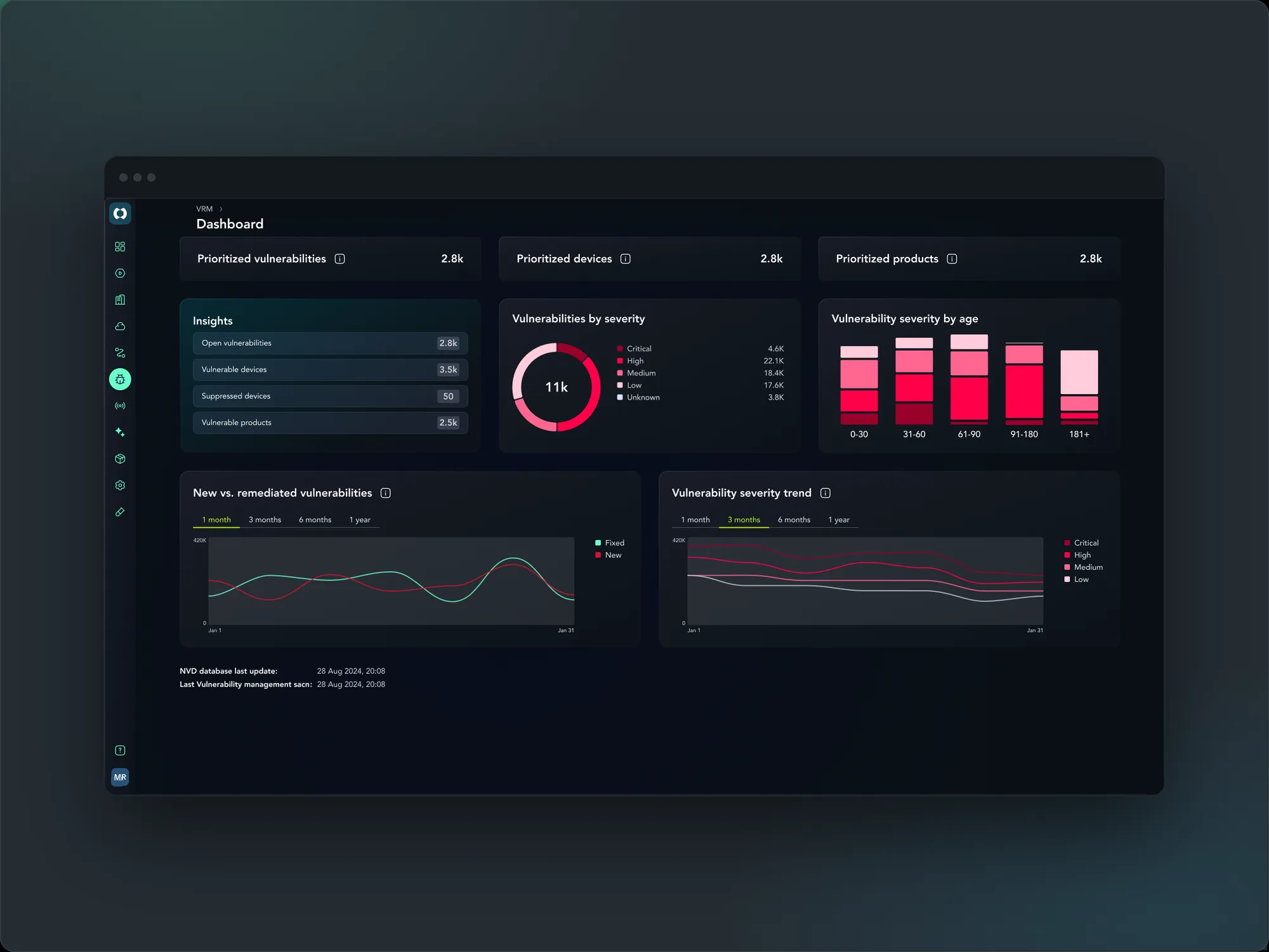
Redesigned Executive Dashboard: Surfacing prioritized vulnerabilities, trend analysis, and age breakdowns at a glance.