XMDS2 Design System
About XM Cyber
XM Cyber is a continuous exposure management platform. It models attacker paths across enterprise networks to highlight critical security risks. The platform spans Enterprise, Cloud, Active Directory, Vulnerability Management, and Detection, with each domain built by distinct engineering teams.
XMDS2: Rebuilding an Enterprise Design System
XMDS2 transformed XM Cyber’s UI foundation from a fragmented code library into a productized, scalable design system. Working as part of a core team of three designers alongside front-end infrastructure engineers, I helped architect a three-tier token model, establish strict component contracts, audit legacy assets, and run an end-to-end component lifecycle from Figma specs to production QA.
My Role
Product Designer on the core XMDS2 team, driving design system architecture, component contracts, and production QA end-to-end.
I owned the complete component lifecycle: defining semantic tokens, writing explicit specs, aligning with engineers in Storybook, reviewing PRs, and verifying refactored UI in production.
- Token & Component Specs: Architected core components for multi-theme scalability.
- Legacy Asset Audit: Led keep, update, unify, or retire decisions for assigned legacy components.
- Targeted Screen Migration: Lead designer for 13 of the ~30 enterprise screens in the replacement roadmap.
- Accessibility Contracts: Authored system-wide specs for focus management and keyboard navigation.
- The Explanation Pattern: Designed and specified a contextual, role-aware help pattern end-to-end.
The Problem
- Hidden UI Fragmentation: Three disconnected asset states existed at once: active Storybook, legacy Storybook, and undocumented code-only components.
- Redundant Patterns: Isolated feature teams built duplicated UI solutions, such as 3 tag styles and 7 table implementations.
- Hard-Coded Styling: Values were hard-coded in stylesheets, making global updates or multi-theme support impossible.
- Missing Specifications: Components lacked documented states, forcing engineers to improvise implementation details.
- Inconsistent Accessibility: Key UI elements like drawers and table popovers lacked standardized keyboard navigation.
- Lack of System Structure: No clear roadmaps, versioning, or defined workflows for team contributions.
Business Goals
- Unify Platform UX: Present a single, consistent enterprise interface across distinct platform modules.
- Accelerate Delivery Velocity: Eliminate duplicate work and speed up design-to-engineering handoffs.
- Enable Systemic Maintainability: Use semantic tokens to allow global visual updates via single-layer edits.
- Guarantee Accessibility: Embed WCAG compliance and keyboard navigation directly into component contracts.
- Manage System as a Product: Run the design system with clear roadmaps, releases, and documentation.
Target Audience
Internal product designers and front-end engineering teams across five domain modules.
User Persona
- The Product Designer: Needs fully specified components with defined interaction states and edge cases to assemble screens quickly without renegotiating component behaviors during sprints.
- The Front-End Engineer: Needs documented Storybook components, explicit code contracts, and clear deprecation paths to swap out legacy UI safely.
Research & Audit
- Systematic Component Audit: Evaluated ~100 components against real production usage, categorizing each into Keep, Update, Unify, Retire, or Discuss to build a defensible migration roadmap.
- Token Standards: Applied industry-standard design token practices to structure a three-tier token hierarchy.
Product Goals
- Token-First Architecture: Zero components reference hard-coded values.
- Clear Component Contracts: Define readiness across 5 criteria: Figma design, written specs, edge cases, Storybook stories, and usage docs.
- Usage-Driven Decisions: Enforce deprecation and unification decisions based on real codebase usage.
- Built-in Accessibility: Treat keyboard navigation and focus management as mandatory component standards.
Solution
Three-Tier Token Architecture
Tier 1 (Raw Values): Hex codes and pixel units, never referenced directly.
Tier 2 (Primitives): Context-agnostic scales, such as color ramps and spacing scales, defining visual relationships.
Tier 3 (Semantic Tokens): Intent-driven tokens, such as surface-input and row-hover.
Impact: Enabled multi-theme support (Light Mode) as a single-layer mapping change without rewriting UI code.
Five-Point Component Contract
Every component in the ~40-asset inventory is tracked against: Design Assets, Written Specs, Edge-Case Definitions, Storybook Verification, and Usage Guidelines.
Systemic UX Patterns (Explanation Component)
A contextual help icon beside page titles revealing page purpose, tab details, and docs on hover.
Permission-Aware: Dynamically suppresses restricted tab descriptions.
Explicit Exclusions: Excluded from entity cards and multi-step wizards where inline text belongs.
Header-Bound: Inherited automatically during navigation updates.
Accessibility Contracts
Standardized keyboard focus-trapping and Escape dismissal across drawers and complex table popovers.
Sequenced Page Replacement Roadmap
Mapped ~30 enterprise pages by component dependencies, producing an executable migration sequence. Owned 13 of these pages.
UX Flow
Old Flow :
- Feature team codes ad-hoc component
- unrecorded duplicate
- design debt.
New Flow :
- Token spec
- Figma contract
- Storybook build
- PR review & production QA
- legacy asset deprecation.
Outcome & Status
- Live Infrastructure: Active design system powering front-end development across the web application.
- Light Mode Shipped: Multi-theme support delivered seamlessly via semantic token mappings.
- Explanation Pattern Deployed: Live across core platform pages, with remaining surfaces updating in phases.
Initial Measurements & Telemetry
To validate the architecture, I set up a measurement framework alongside the infrastructure build, using codebase audits, Jira cycle-time tracking, Chromatic visual testing, and FullStory UX telemetry.
- Component Adoption Rate: Measured by cross-referencing static codebase imports (AST analysis) against FullStory runtime DOM data. Tracking static imports alone only proves a component was bundled; validating against rendered DOM nodes accounts for dead code and gives us the true adoption rate across core modules.
- Screen Assembly Velocity: Measured via Jira sprint cycle times from Figma handoff to final production sign-off, tracking team throughput before and after onboarding to XMDS2.
- Duplicate UI Drift: Monitored via GitHub PR linter checks and Figma component analytics to flag custom variants built inside local feature folders, treating duplicates as a signal for discoverability and documentation gaps rather than component coverage.
- Cross-Theme Parity Defects: Tracked through automated Chromatic visual regression in CI/CD to catch Light and Dark token mismatches prior to release, backed by FullStory session replays to audit edge-case contrast compliance.
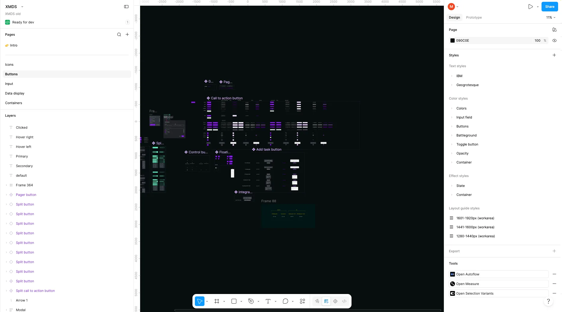
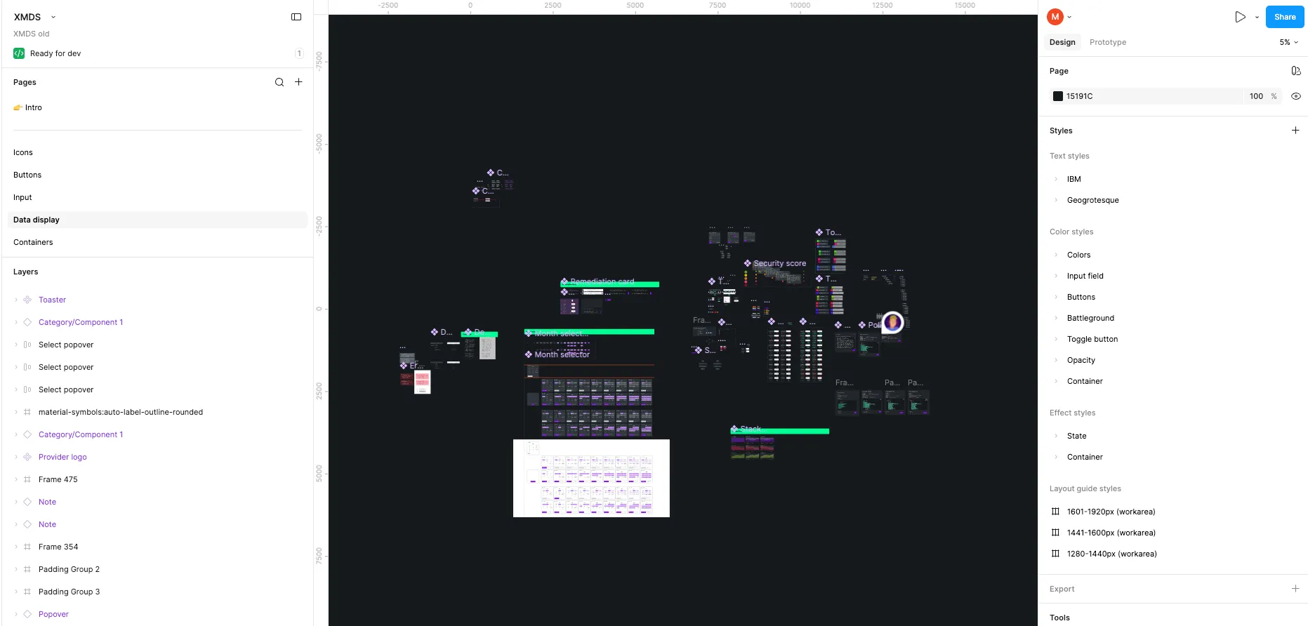
Old Design System (XMDS)
Legacy Figma Workspace: Undocumented assets, hard-coded color styles, and fragmented component libraries prior to the system rebuild.
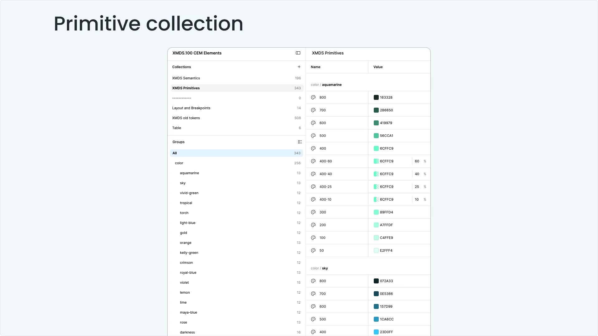
New Design System (XMDS2)
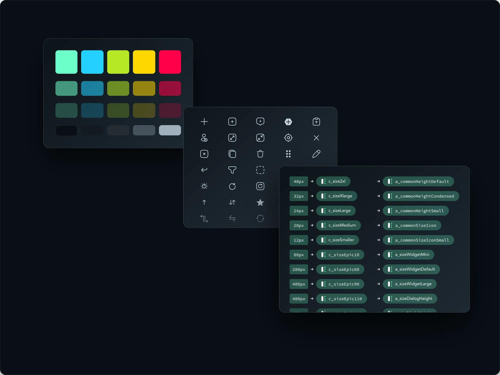
3-Tier Token Architecture: Structured primitive color/spacing scales mapped cleanly into semantic, intent-driven tokens for multi-theme scalability.
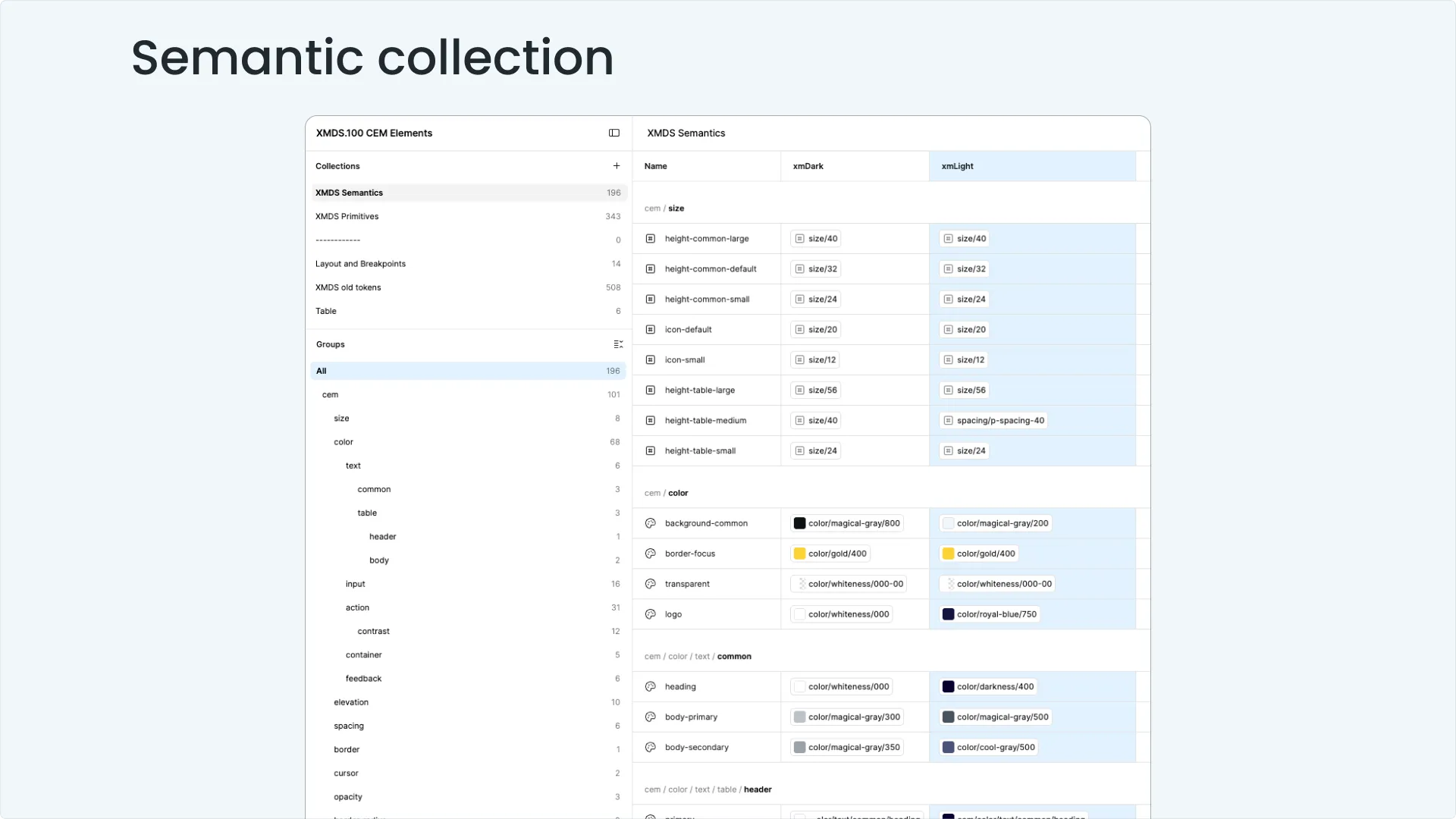
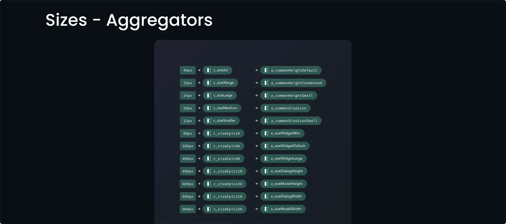
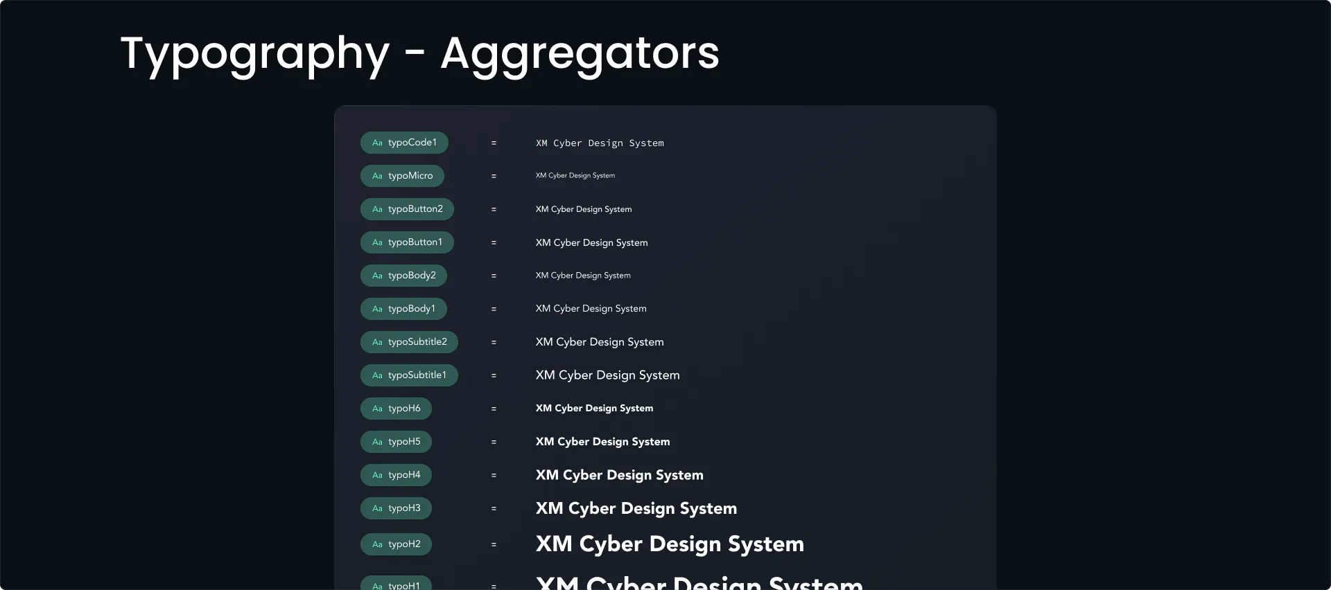
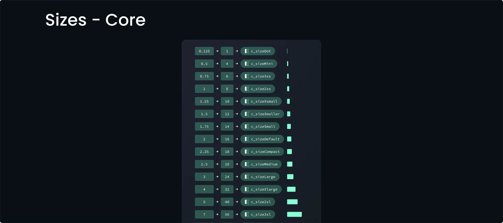
Component Sizing & Typography Tokens: Standardized dimension tokens and text styles ensuring spatial layout rhythm across all 5 platform modules.